“PUSH PLAY”
WOODHOUSE - NYFWM
Photography Dan Lecca
Backstage & Designer Photography Imhotep Hester
Interview Arielle Chambers
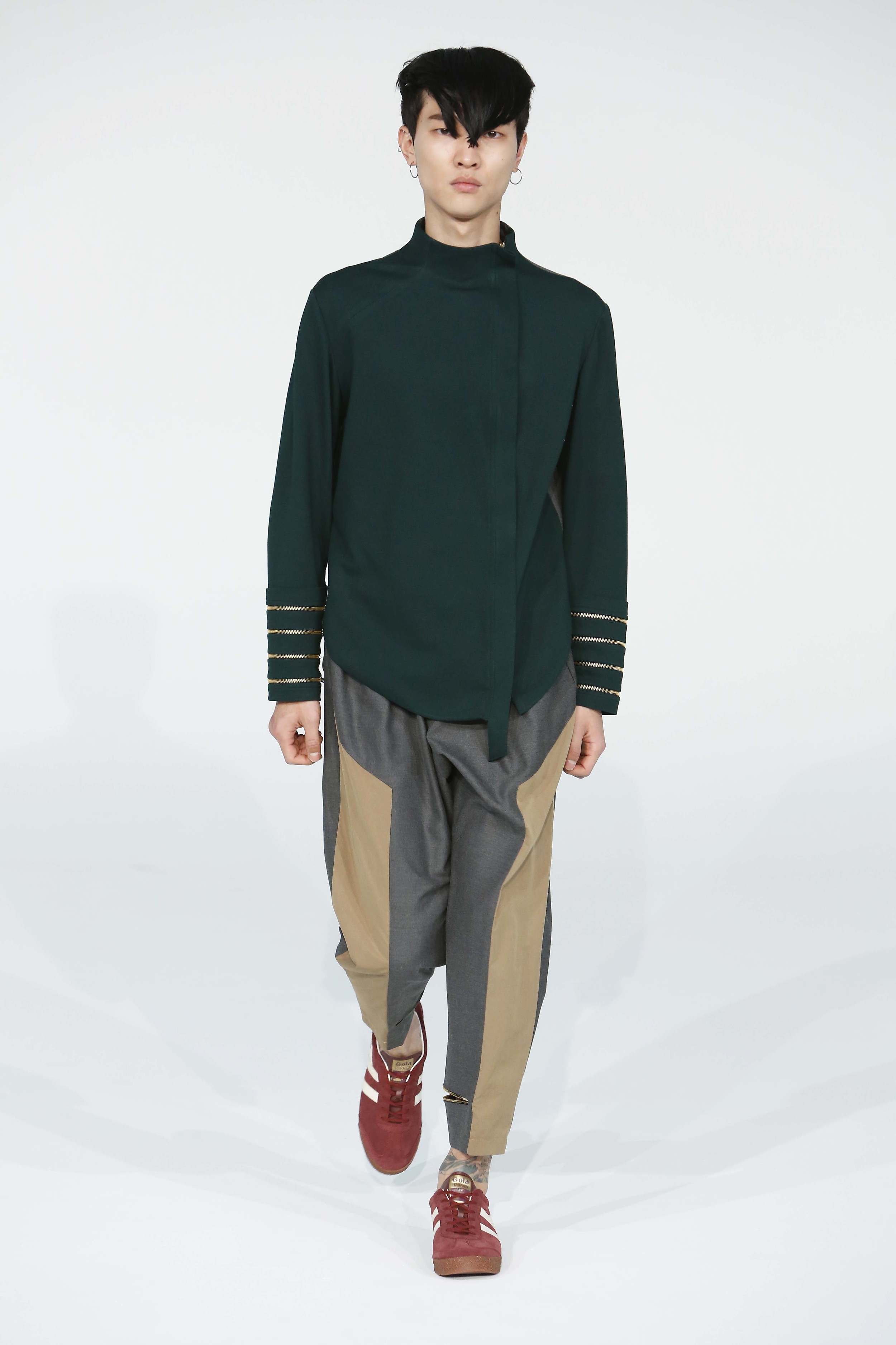
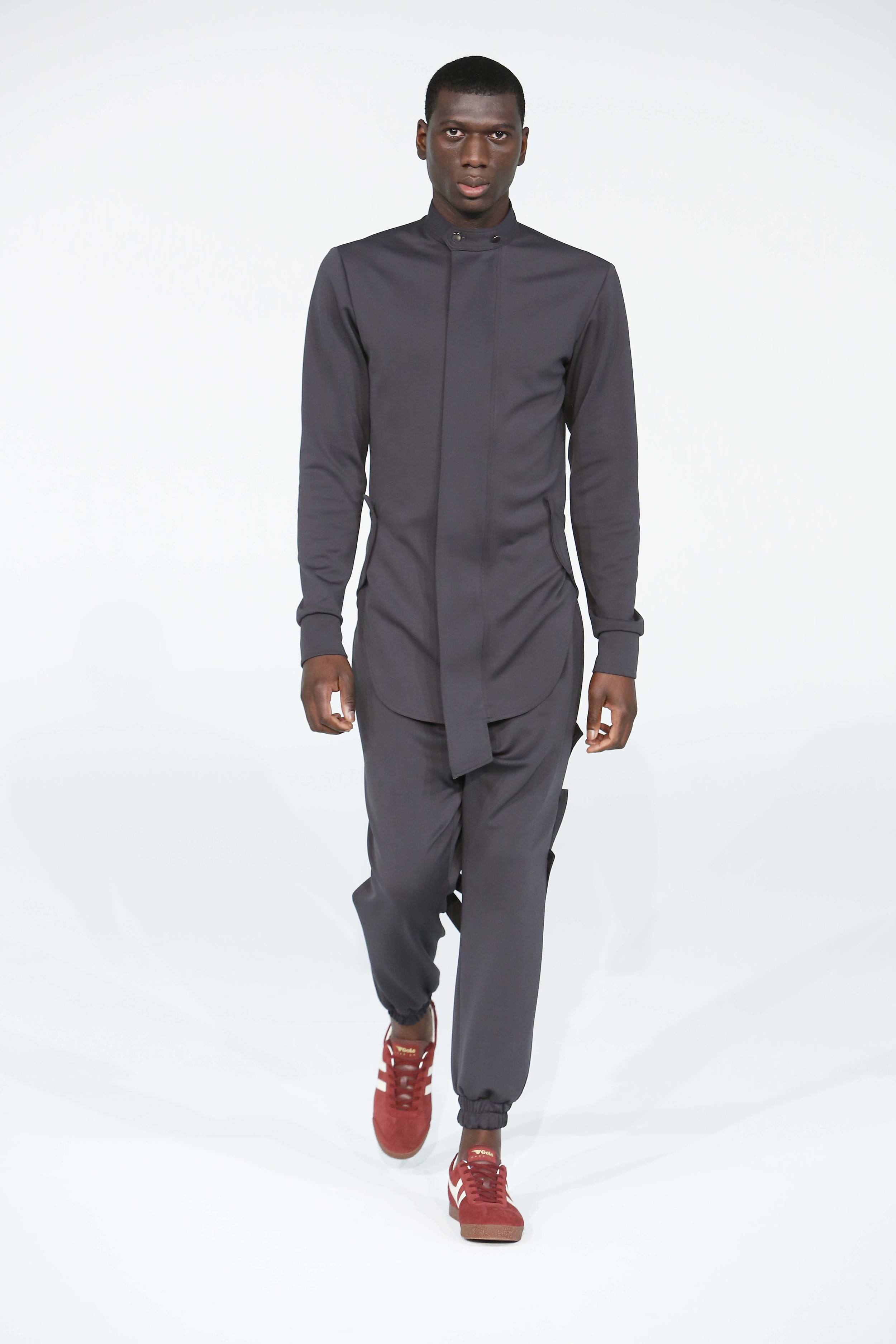
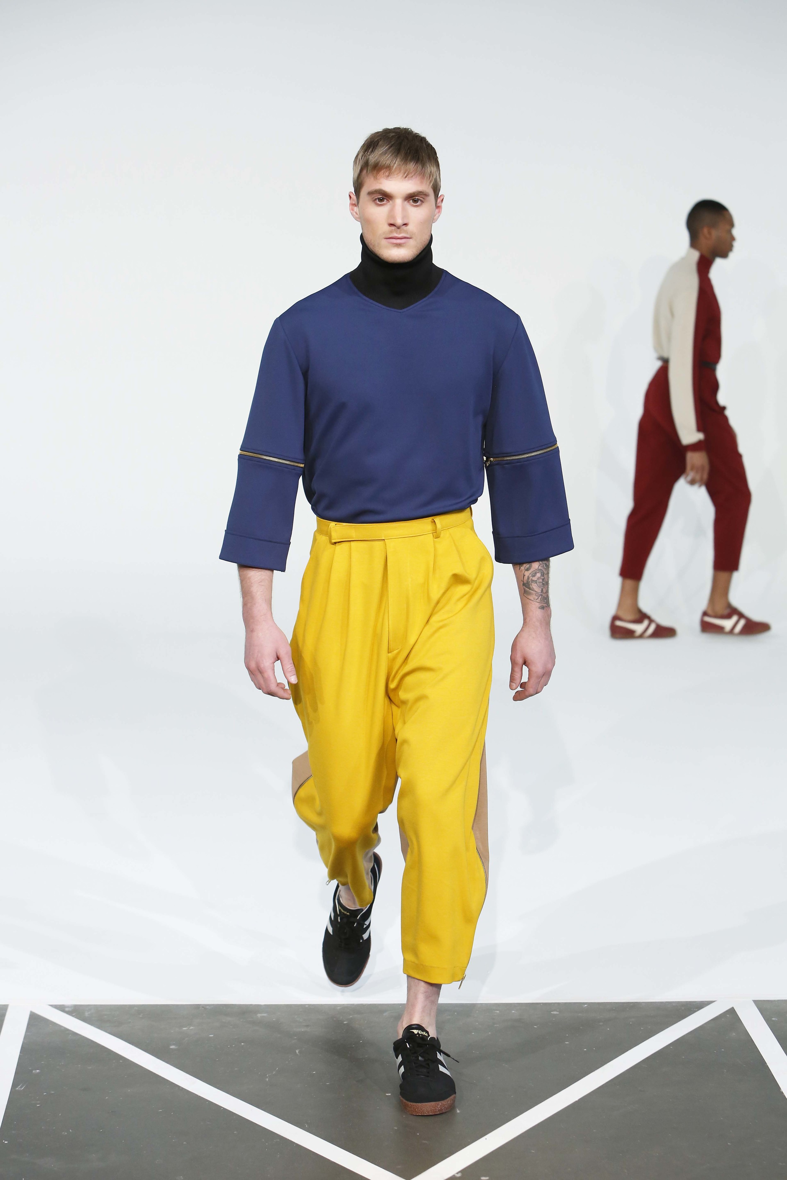
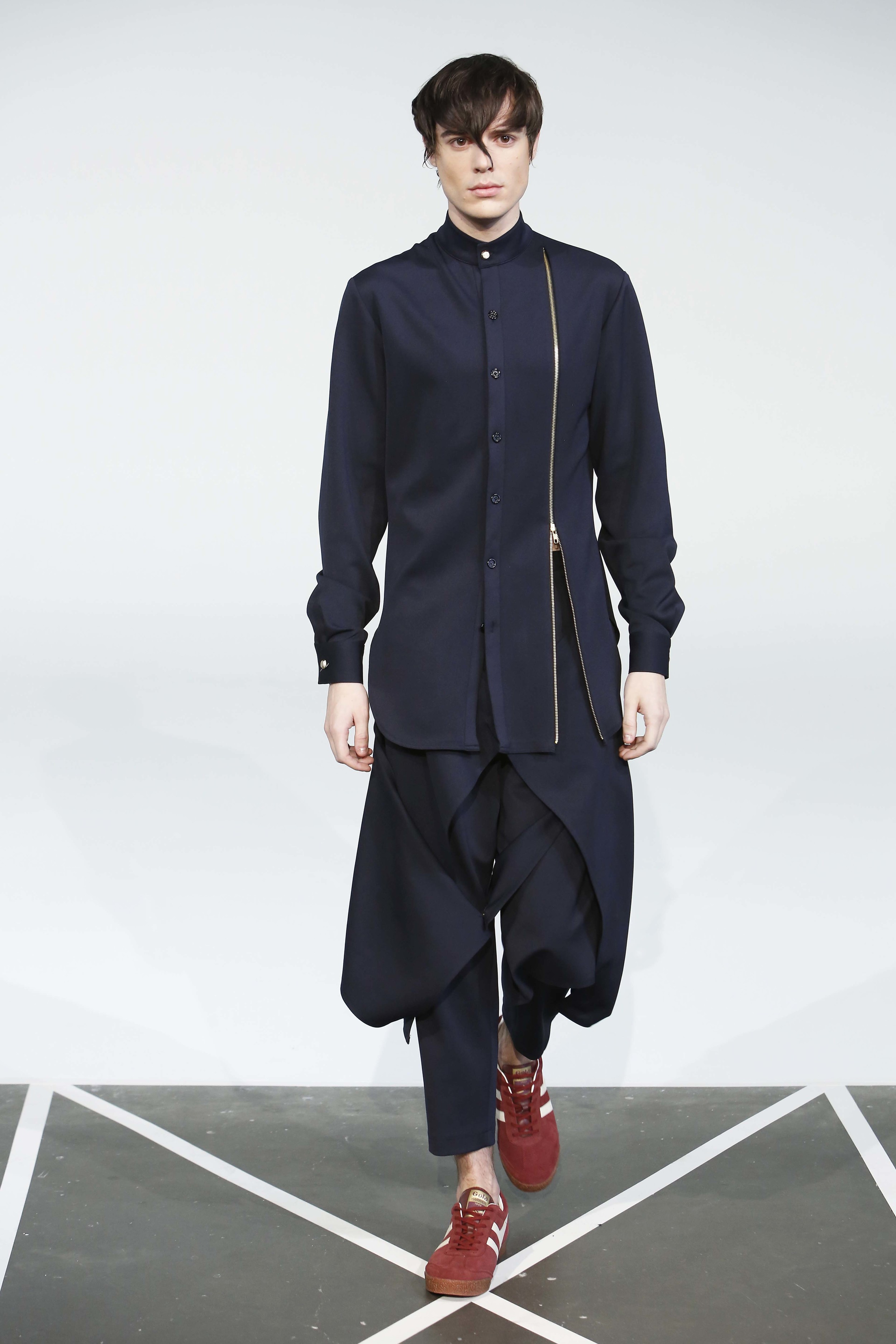
Fall/Winter’16 carries the ongoing trend of blurring the lines of masculinity. Though common among most designers showing this season, execution of androgyny and non-binary standards differentiates collections. Series of murses (man-purses) and gender-bending color pops have been showcased, but Julian Woodhouse took to silhouettes, shaping and strategic use of gem tones to set his collection apart from the rest. We had a chance to speak with the designer pre-show to get the insight on his collection, everything from his decision to use various emeralds and rubies, to the high-waist pant prominence.
Arielle Chambers: What was your inspiration behind the FW16 collection?
Julian Wood House: WOODHOUSE takes womenswear clothing and uses it as inspiration for menswear. What that really means is, I like to give men different options. I want to give men something with a silhouette, something a bit different from what they’re used to seeing. So with high-waist, there is different detailing that you would normally see in womenswear that are incorporated into menswear.
AC: It’s sort of crossing the line?
JW: Exactly. That’s as far as silhouettes, but as far as where color is concerned. I started with emerald then chose other jewel tones that would fit really well with that. So you have maroon, burgundy, we have some greys in there some whites and ivory colors.
“The WOOD HOUSE man is anything but a haphazardly thrown together. He is daring with an intricate eye for detail. This collection is an emotional snap shot of the man I imagine when I gaze into the future. In a place where social constructs of masculinity no longer choke the men it attempts to guide. I imagine men will dive head first into color they feel strongest in but will take their time traveling through each an every detail or feature of a garment, much like the modern woman, before bringing it into their lives. This collection is bold, textural, yet mild in regards the color palette I wanted to create an emotion with the deep hues. My goal is to communicate freedom to inspire liberation.”
What do you want to distinguish with this collection as compared to previous works?
With my collections, I kind of base them upon how I feel and how I am dressing myself. For the first collection I was wearing a lot of black, so it was kind of darker. The silhouettes were similar to this collection, but I wanted to stick with monochrome. With the spring collection I wanted to break away from the dark silhouettes, and I went the complete opposite direction using color blocking. This collection is more of a combination of the past two.
As I’m observing your collection, I’m wondering why the selection of jewel tones, versus any other color options?
Well I did something really interesting; I broke all of the colors into cities or towns of where people would be from. For emerald, it would be Emerald City, red stands for Red City and ivory is Ivory City. I worked with that concept and then I kept going because I felt they were really great colors that work well with each other. They really look good on the body in certain ways and I think the guys look really great in them.
Did you pursue any new techniques while creating your FW16 collection?
As far as turtlenecks, I changed the style of it this collection. For instance, placing the seams in a different location, I think it accentuates the neck a lot better. It doesn’t rise too far. Altogether for the person who is wearing it, doesn’t appear to have a super long neck, so they would still look really good in it. As far as pants, I still stick to high-waisted pants, as you probably know doing a high-waist changes the pleats, how it fits in the hips and the crouch as well. That’s kind of a new thing we’re doing too.
Could you tell me a bit about this navy blue piece, what inspired this one?
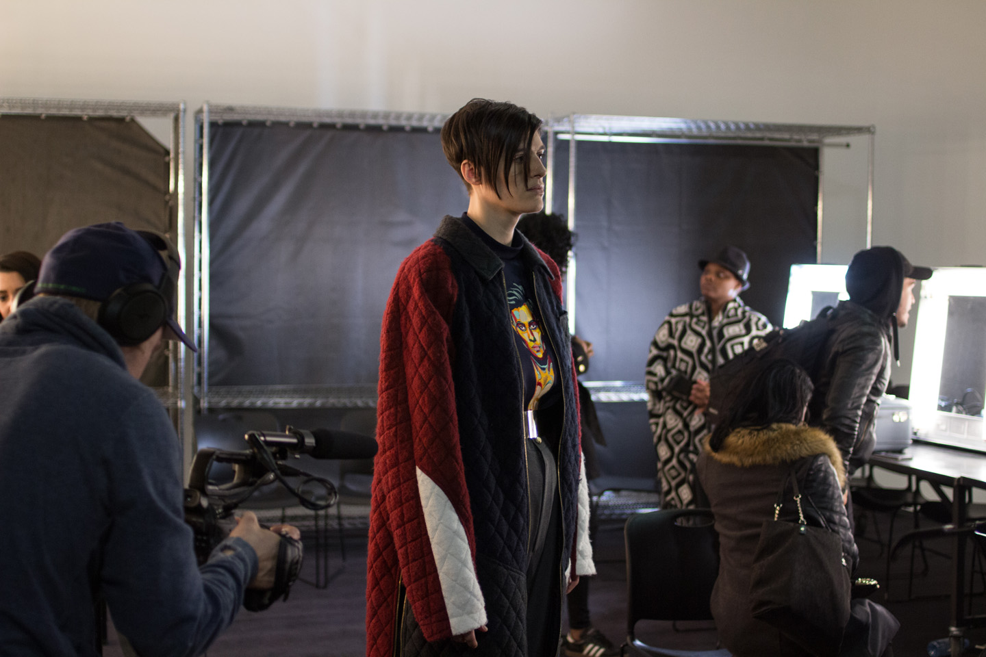
I wanted to add panels. Panels are something I do a lot of in this collection, with it on the front, back or side. I think it creates a really interesting piece in the back because the pants are two toned, one color in the front and the back and the strap is what brings the whole thing together.
What was the toughest challenge you’ve faced developing your latest collection?
My toughest challenge was choosing how to make it better at the end. I designed in phases; my first phase was trying to figure out the coloring. The second phase was figuring out the silhouettes and then after that I had to figure out how to make it cool. So I added embroidery to make the detailing, also finer details such as buttons and additional pieces.
And what’s the overall impression, if you want one lasting impression on the audience?
I want them to see that, this is an image of how I think menswear will go towards in the near future, men just having new options and even more things that they can wear in different ways. Like lower-waist or higher-waist.

